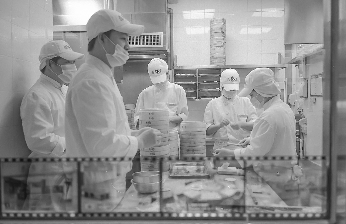
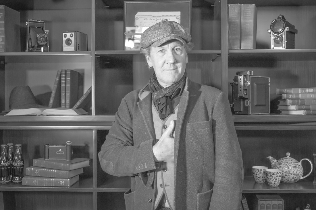
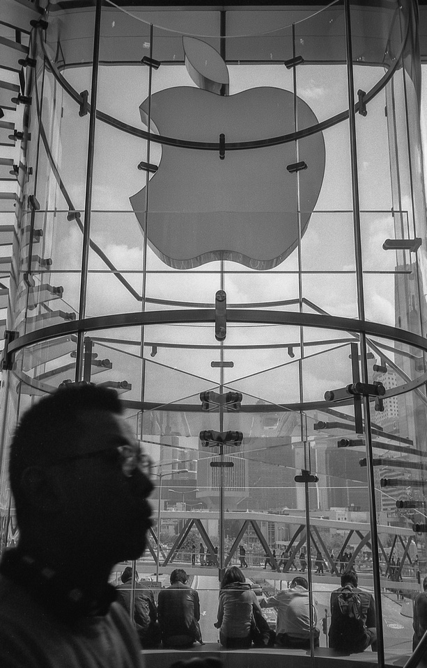
Blog #99 High-Key
Blog #99 High-Key
There are many techniques involved in making images. You can use various films, papers, screens, and even other materials like canvas, metal, or wood. There are also many ways to present the image itself. There is the “properly” exposed image which in itself is debatable although the camera can usually do this by itself when set to auto exposure mode.
During a traditional portrait shoot and lighting, the “Key” or main light is usually placed near the camera or slightly camera left or right. The “fill” is then placed almost 90 degrees to the key or main light to do exactly what you might expect which is to fill up the shadows made from the key light with more light. The fill is usually less than the key but it can be equal to the key for evenly spread light. This type of lighting is common in professional portraits, headshots, advertising, commercial, fashion, and product photography. The subject should be well lit in these types of images.
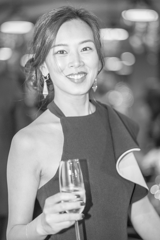

Then there is High Key or Low Key for example. Low Key or Film Noir types of images tend to be dark and moody. There is an air of mystery or even a downright eerie feeling to low-key shots. High-Key images have a lack of contrast or low contrast. Shadows are minimal to non-existent. They are light, airy, and tend to have an uplifting mood to them. Portraits tend to have a dreamy or even an angelic quality. Some very high-key images tend to have a penciled or sketched effect to them.
Each [high or low-key] represents a lighter or darker rendition of the properly exposed image to accentuate the mood of the image. Light vs. dark, yin vs. yang, good vs. evil, and on and on.
Although High-Key images can be presented in black and white or colour, black and white is the more common.
Black and white are the colours of photography. To me they symbolise the alternatives of hope and despair to which mankind is forever subjected.
Robert Frank
I agree with Mr. Frank.
The light is always right.
jhg
*Images: © Jeremy H. Greenberg
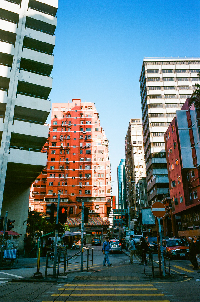
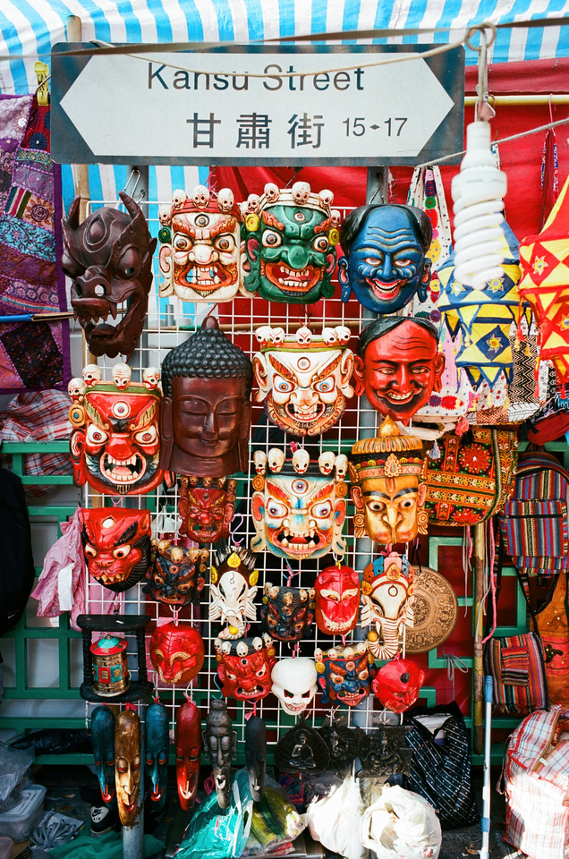
Where: Hong Kong
Subject: Various Portrait, Street Photography, and Urban Landscapes
Gear: Fujifilm Mirrorless, Nikon 35mm film cameras


Casual Photophile Tip & Techniques No. 001 The Subject is the Subject
The Inspired Eye Photography Magazine Issue #40 (full interview)
Hong Kong Free Press: HKFP Lens
Blog #25 Don’t Be Afraid of the Dark[room].
Blog #47 Composition, Composition, and More Composition
Blog #65 Summer is for Travel (Hanoi)
Blog #67 Risks, Rules, & Restrictions
Blog #68 Photography is a Gift
Blog #72 Living the Creative Life
Blog #90 Restrictions, Revisited
Blog #93 Photographic Technique
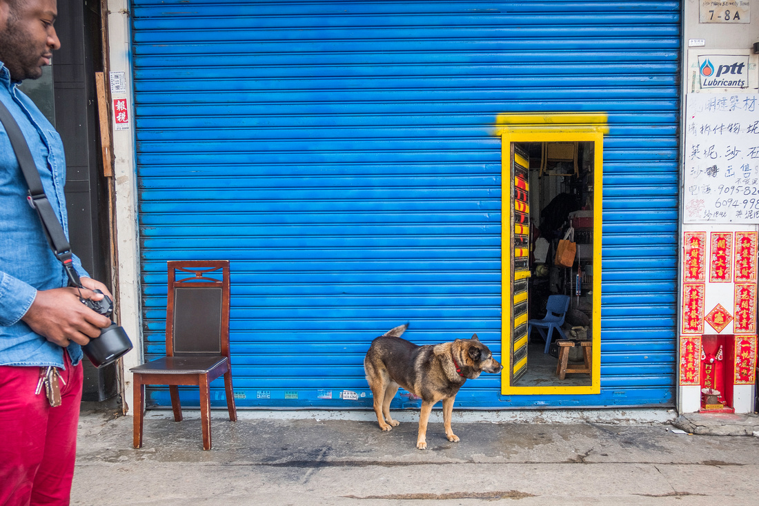
Blog #98 You better WORK!
Blog #98 You better WORK!
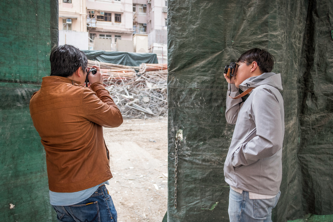
Last month, I hosted a workshop in collaboration with six members of a local photography walk group Shutter Alliance. The format of the workshop was approximately as follows:
[9:00 - 10:00] Introduction and Keynote presentation on Basic Photography and Composition / Assignment to approach stranger and request making a portrait of that person: Office Meeting Room
[10:00 - 11:30] Walk outside an make interesting street photos that work: Streets around Kennedy Town
[11:30 - 1:30] Each member loads three images into Lightroom for critique: Office Meeting Room
Using a 15” Macboook Pro and Adobe Lightroom software, each member loaded their SD card and selected their best three images for the live group critique. The laptop was connected to a projector and images were displayed one at a time on a proper screen while the group sat around at a couple of round tables in an office setting.
The focus of the workshop was really the critique component. The activity of critiquing images is really about describing. The goal of the exercise was to talk about the different parts of each image, discuss if the image works or did not work and why that might be the case.
The group was very engaged and there was a range of experiences. These were hobbyist or amateurs and to my knowledge none of the participants were professional photographers. Nevertheless, the images produced in this short one hour and a half session were very impressive. There were maybe 2-3 images of the 18 displayed (not counting my own) that did not work. There was promising work displayed and we aimed to use some of the vocabulary from the earlier presentation to use in the critique session.
The group was clearly engaged and benefited from the experience. We ended the workshop on time at around 1:30 and parted ways. One participant joined my later that afternoon at F11 Foto Museum in Happy Valley to see the Alexander Rodchenko exhibit. I will blog on that subject in the coming week or so.
The participants completed a questionnaire where I requested for them to comment on the components of the workshop. I was pleased to have shared beneficial information, my life experience, and a valuable critique with the group.
Interestingly, when asked what topics of interest the group had for future workshops, all wanted to learn how to develop film! Now I’ve got my work cut out for me. Next time film it will be!
The light is always right.
jhg
*Images: © Jeremy H. Greenberg March 2018
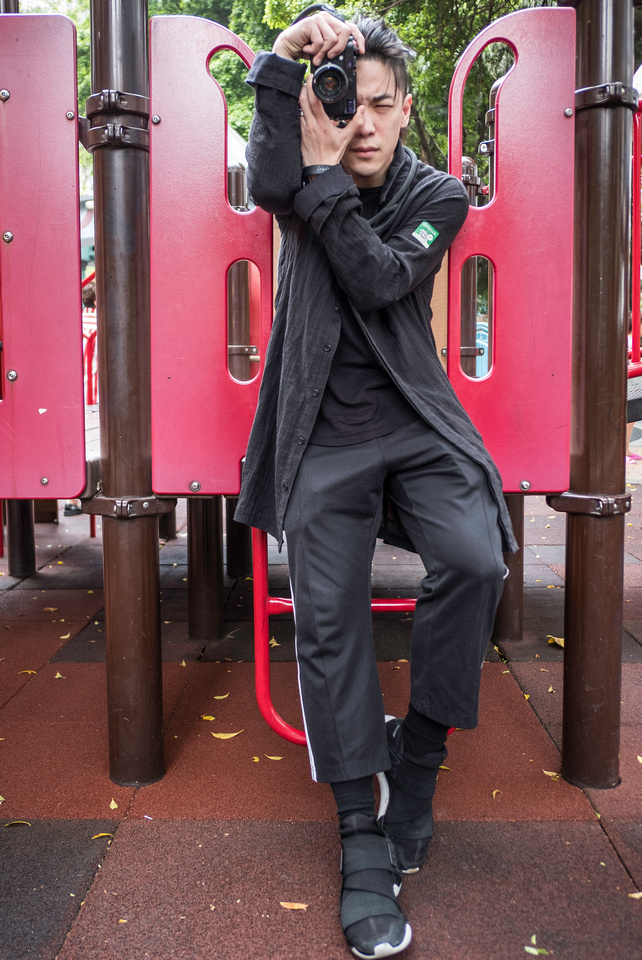
Where: Kennedy Town, Hong Kong
Subject: Street Photography Workshop
Gear: Fujfilm X-E3 + Fujinon XF 18mm f/2

Casual Photophile Tip & Techniques No. 001 The Subject is the Subject
The Inspired Eye Photography Magazine Issue #40 (full interview)
Hong Kong Free Press: HKFP Lens
Blog #25 Don’t Be Afraid of the Dark[room].
Blog #47 Composition, Composition, and More Composition
Blog #65 Summer is for Travel (Hanoi)
Blog #67 Risks, Rules, & Restrictions
Blog #68 Photography is a Gift
Blog #72 Living the Creative Life
Blog #90 Restrictions, Revisited
Blog #93 Photographic Technique
Blog #97 Job Description: Photographer
Blog #97 Job Description: Photographer
You have just been hired! You have one job to do. Show up early, make stunning photos and deliver them in a timely manner to the client. That sounds all fine and good but the devil is in the details as they say. Woody Allen famously once said “80 percent of success in life is just showing up”. Obviously you need to show up and show up early. Here, I would like to discuss the remaining 20%.
You will need to be clear that you have what it takes to get the job done. Your gear [and backup gear] must all be fully functional and working - no excuses! Failure is not an option. Test your gear under various conditions, bring a back up body, lens, and multiple [charged and tested] batteries.
I use a Google Forms questionnaire to understand the clients needs so that I can be confident that I understand what they intend to get out of the shoot and I can give them what they need. I was asked once to make an image of a small group for a promotional brochure. After working with this group one sunny and hot afternoon under time pressures and outdoors, we came up with a few good images after the obligatory two-hours of post processing.
 It was only then that the client said to me “Oh, yeah these are nice but we need a portrait image not a landscape”. Crikey! If I only knew that before! Fortunately they were able to work with one of the horizontal images that had enough on the sides to crop it for the intended usage. The image was sent to the printer before the deadline and the day was saved.
I got lucky there but learned by lesson. My questionnaire gives the opportunity to the client to describe what the images will be used for, if they need black and white, color, both, portrait, landscape orientation, both, images sizes, method of deliver such as online or flash drive, both, and more.
The old adage, an ounce of prevention is worth a pound of cure applies even more so to photographers since we get one chance usually to get it right and that’s it.
We will not nail every shot or every photo shoot but we can decrease the chances of failure. It’s tricky stuff making awesome images for other people. It’s thrilling when you get it right. I’ll leave you with a quote…try to guess who said it
Luck favours the prepared, darling!
The light is always right.
jhg
*Images: JHG March 2018
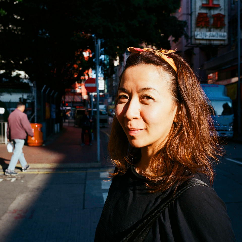
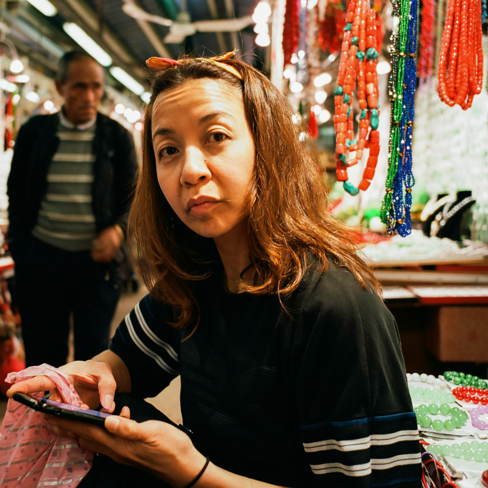
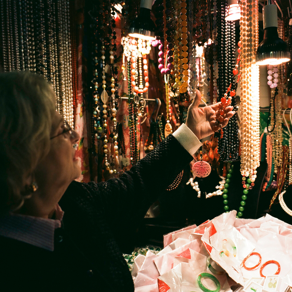
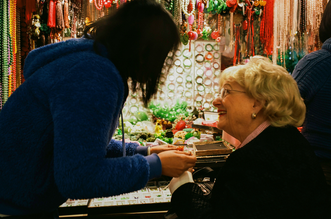
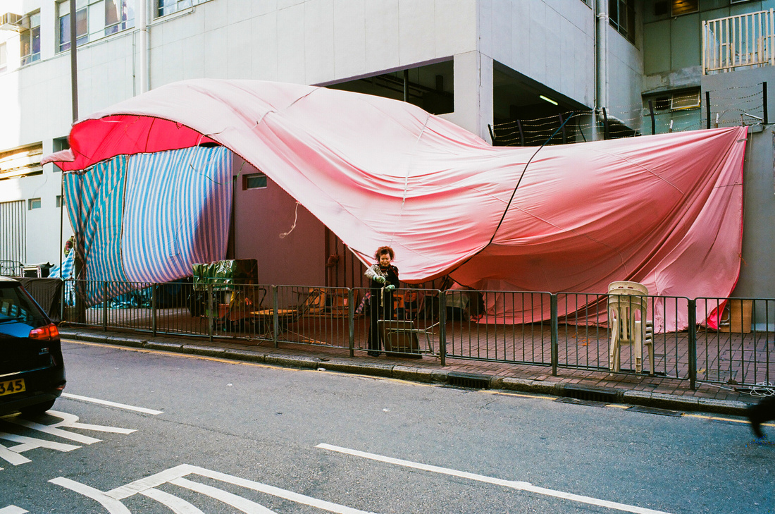
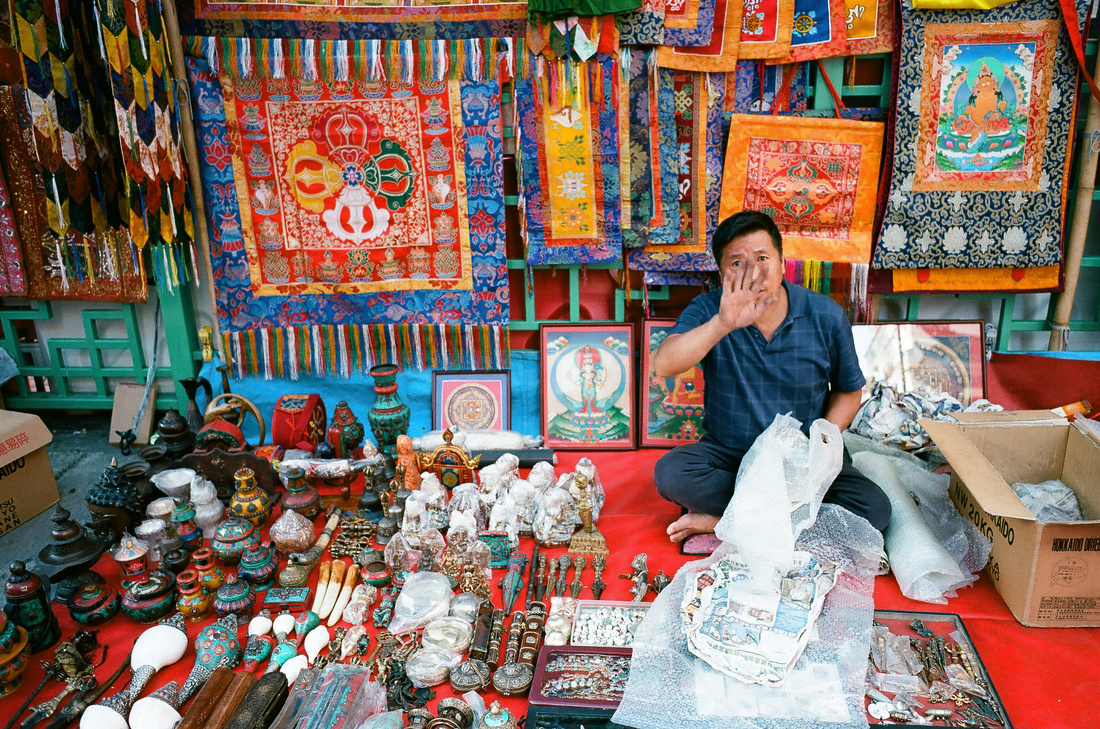
Where: Temple Street, Jordan, Hong Kong
Subject: My two favourite ladies, my dear old mother Sheryl and lovey wife Christine. Gear: Minolta CLE, Leica 28mm f/2 lens and Kodak Ektar 100 Color 35mm film.


Casual Photophile Tip & Techniques No. 001 The Subject is the Subject
The Inspired Eye Photography Magazine Issue #40 (full interview)
Hong Kong Free Press: HKFP Lens
Blog #25 Don’t Be Afraid of the Dark[room].
Blog #47 Composition, Composition, and More Composition
Blog #65 Summer is for Travel (Hanoi)
Blog #67 Risks, Rules, & Restrictions
Blog #68 Photography is a Gift
Blog #72 Living the Creative Life
Blog #90 Restrictions, Revisited
Blog #93 Photographic Technique
Blog #96 What's your :DEFAULT:?
Blog #96 What’s your :DEFAULT: ?
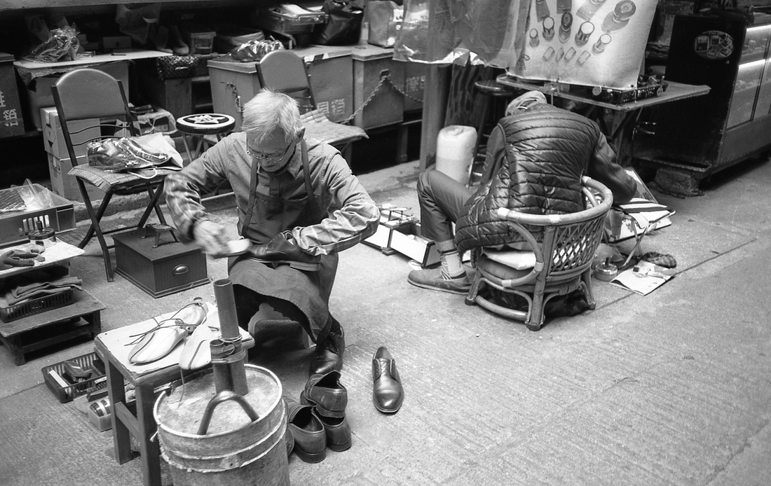
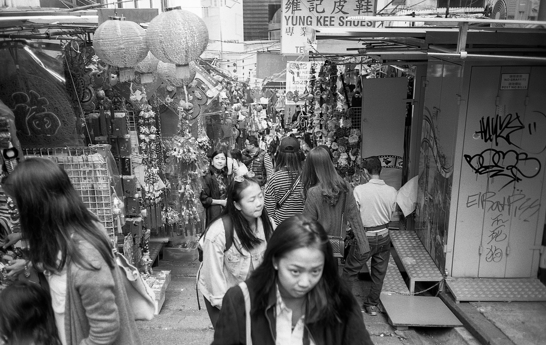
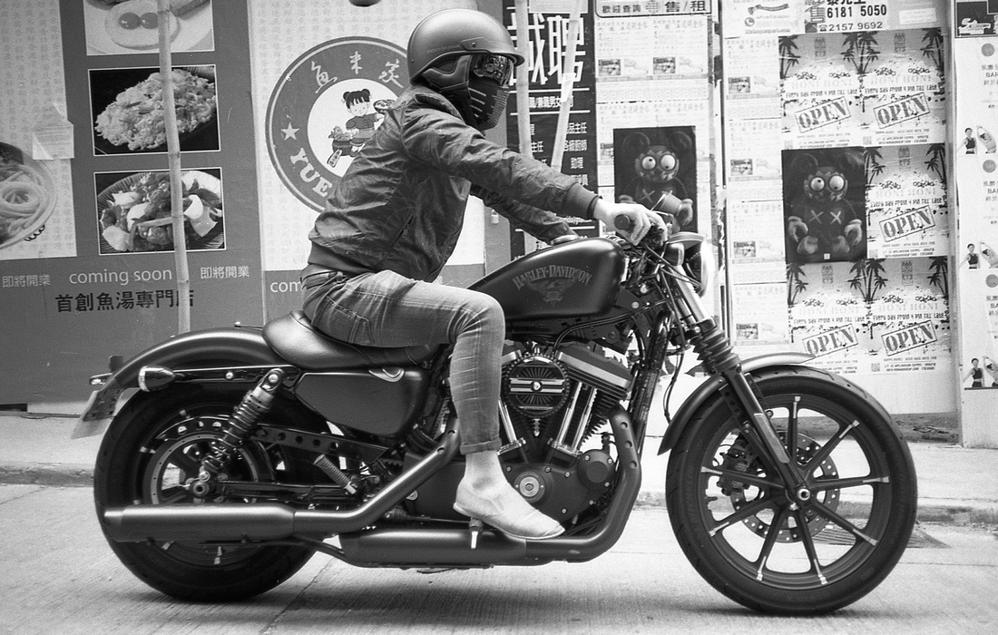
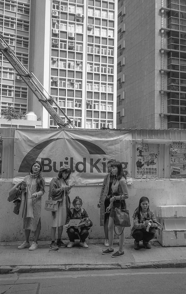
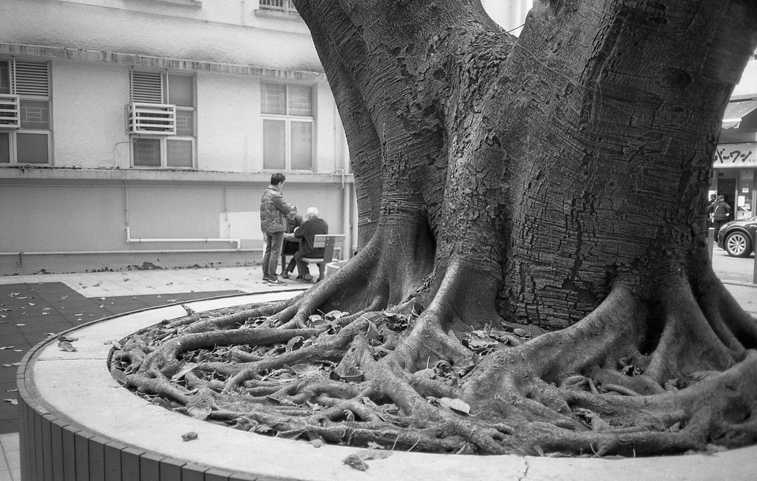
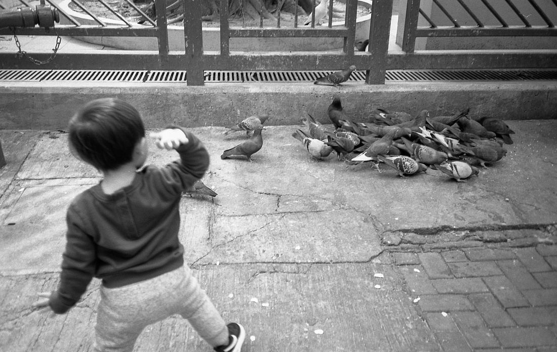
Most photographers whether you are just starting out, a hobbyist, proper amateur, or a professional for many decades have a default. A default is the “usual” or standard of some type in terms of gear. For me, it’s 35mm black and white film. Without a specific project or commercial activity that I am working on in a given day, I will stuff one of my Nikon F-something SLRs or perhaps a Leica rangefinder mated to a 28mm with a roll of Kodak’s TMAX 400 and head out into the world. I will occasionally shoot with a 35mm, 50mm (or zoom lens around the same range) and I do shoot colour film from time to time, but that’s my default. Yes, I’m old school but not all of the time. My default digital is the Fujifilm X-E3 with a 28mm lens.
There is a sense of familiarity and predictability that using my default package affords me. I know where all of the buttons, dials, and focus rings are one the camera bodies, for one. I am intimately familiar with these three focal lengths which are not very different for starters, and I have a good feel for 400 speed black and white film and its capabilities in changing light conditions.
There are those who will advocate for using the same focal length for one year. If there is such as thing as Photographic ADD I definitely have it. Maybe I’ve gone one whole month with the same lens and same camera…at the most. I used to have a tendency to change lenses fairly often like week to week usually. These days I stick to one focal length for a bit more time. I agree with those single-lens zen photographers that there are many benefits to going steady with one focal length.
For personal projects or just for the hell of it, 35mm black and white film is where its at for me. It’s timeless. It’s what I grew up on and it still looks awesome to me. After a fair period of experimenting with cameras, lenses and films as well as digital versions of the same, I have found my “happy place”, my default.
Experiment and then know your default. Committing to a type of default is a type of restriction that may, in turn, spur on your creativity. This sounds counterintuitive, granted, but it works.
So what’s your default package? Please do share here or on my Facebook page. Maybe a survey is on the horizon? Whatever your default is, enjoy it and exploit it.
The light is always right.
jhg
*Images here are from Hong Kong and made with a Nikon SLR, a 28mm wide angle lens, Kodak 35mm black and white film (probably TMAX 400) and developed at home*
Casual Photophile Tip & Techniques No. 001 The Subject is the Subject
The Inspired Eye Photography Magazine Issue #40 (full interview)
Hong Kong Free Press: HKFP Lens
Blog #25 Don’t Be Afraid of the Dark[room].
Blog #47 Composition, Composition, and More Composition
Blog #65 Summer is for Travel (Hanoi)
Blog #67 Risks, Rules, & Restrictions
Blog #68 Photography is a Gift
Blog #72 Living the Creative Life
Blog #90 Restrictions, Revisited
Blog #93 Photographic Technique
Blog #95 Red
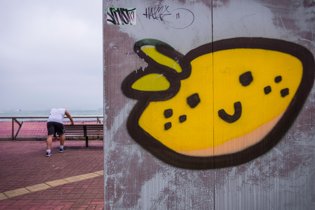
Blog #95 RED
It might seem awkward to blog about a single color but there are some facts about color and specifically the color red that I find fascinating and I hope that you will too. Unless you’re dead set on shooting black and white all of the time forever and ever, eventually you will succumb to work in color.
I absolutely love and prefer black and white photography to color, in general. Ultimately, creating art and telling stories is not about cameras, focal lengths, film, grain, pixels, or color for that matter. Making images that matter is about having an interesting story to tell and using the right medium to tell that story. It’s about using the right tool for the job. My recent Blog #93 on Photographic Technique was about that very subject. You will need to be proficient in using color in your images to tell some of your stories that will need to be communicated through the language of color.
“Color” is word and a language concept that is more or less universal across cultures of the world. Red has some special significance with regards to all of it’s brothers and sisters in the visible light spectrum. Wait, did I just suggest that colours have a gender? Actually, this has been established a long time ago. Latin and romance languages such as Spanish attribute gender to colours. Red or rojo is masculine [strong] unless used to describe a feminine object such as a red rose or rosa roja. It’s common knowledge that roses are female, yes?
There are some factors and functions of the use of the color red historically, culturally, politically, and socially that may influence how or even if we decide to include this into our images. I’ll expand on these concepts later.
Technically, color is a type of electromagnetic radiation [from the sun] that falls with the visible light spectrum. There are parts of th spectrum of electromagnetic radiation that are not visible to humans such as gamma rays, X rays, ultraviolet rays, microwaves, and radio waves. All of these particles and waves differ by their wavelength and wave frequency that are measured in units called nanometers [nm] or terahertz [THz], respectively. The way in which color hits your eye will affect the spectrum of color on different dimensions such as intensity (brightness), and hue. Color can be defined from a physics point of view as “class of spectra [light] that functions to result in color sensations that are species specific”. The species reference here is used to highlight the fact that different species of animals have differences in the rods and cone structures of the eye that allow for differences in accuracy, distance, night vision, and color interpretation in the brain of the animal.
Red light is in the longer wavelength range of 700-635 nm and 430-480 THz wave frequency range reacts with the cone cells in you eye which causes an electro-chemical reaction in your brain that gives you the sensation and perception of seeing red although literally, not like the idiom seeing red meaning becoming upset or angry. It would be natural to wonder at this point, Is your red the same as my red? Do all people see red the same? That is a difficult question to answer, definitively, since we cannot measure perception and experience beneath the skin yet. However, we can measure language responses to color as behaviors that can be observed, measured, and compared across people. Therefore, a logical and reasonable response to the inquiry above might be “Yes, they are the same, probably, if viewed under similar or identical environmental conditions.
We learn as children to talk about red and we agree on red. Therefore, your red is my red and my red is your red. Let’s continue.
As mentioned above, there are many ways in which the color red has influenced us culturally, historically, politically, and socially. The list below shows ten examples.
- Red is the color of blood, meat, many foods, the sun [flag of Japan] fire, power, life, and death. Stop signs are red to warn of the dangers of failing to stop while driving.
- From ancient times, dyes that were used to make the color red were highly sought after, prised, and rare.
- Ginger is the name given to people with red hair although red hair only occurs in about 1% of the population. Many cultures have strong beliefs about people with this hair color that vary from ridicule to admiration. Today, stereotypes may continue that red heads have fiery personalities.
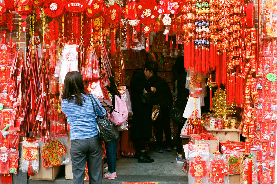
- Red is used extensively in Chinese culture. Originally used as a bright colour to evoke fear by representing blood or fire, the color red was thought to be able to scare away evil spirits. This is still used in Chinese New Year and other festivals regularly and represents good luck and good fortune.
- When Director Steven Spielberg’s filmed Schindler’s List, he chose black and white. There was one striking scene later in the movie when a little girl runs through a concentration camp wearing a bright red coat. The movie is a remarkable story about a man named Schindler who repeatedly risked his life to employ and hide Jews during World War II in Nazi Germany when the Holocaust was happening. The red coat gives the viewer a spark of hope, a sense that the Jews might actually survive the madness and atrocities of the time and the scene represents a very effective cinematic use of selective coloration.
- Red (2010 film) and Red 2 (2013 film) were American action comedies based on a DC comic book series by the same name.
- During the Cold War, “The Reds” was the nickname given to Communists by the Americans and the West. This may have been a reference to the “Red Coats” name used to describe the enemy soldiers of the Crown of England during America’s Revolutionary War centuries earlier who literally wore red coats most likely with the intention of sticking fear in their enemies. Sorry mates, but we all know who won that one!
- Red has been used in many revolutions [i.e. Chinese, Russian, Vietnamese, Cuban) and in military insignia. “Red” states are considered those who vote republican [the party of the white wealthy minority] compared to the more popular democratic blue states in America.
- The Catholic Church has used red in ceremonial activities such as in the clothing of cardinals. The Crusades, and the flag of England used red.
- Many activities of people in modern times are expressed using the color red. Love, Valentine’s Day, passion, happiness, ceremony, celebration, sports [Cincinnati Reds], flags of many nations, anger, aggressive behavior, warning, danger, and sexuality.
Finally, color photography tends to work well when the color or colours that are being included into the image have a defined place and role. Red is a strong stand-alone color. It goes great with green, blue, yellow, and its variations are countless. Have you ever noticed that Red is usually the first color in a box of crayons, or used when teaching kindergarteners the colours of the rainbow [ROY G. BIV].
Ted Forbes from YouTube’s The Art of Photography did a Photo Assignment on Red that is worth viewing for some inspiration on the subject of color and on red, specifically.
The [red] light is always right!
jhg
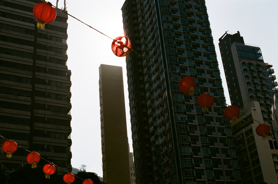
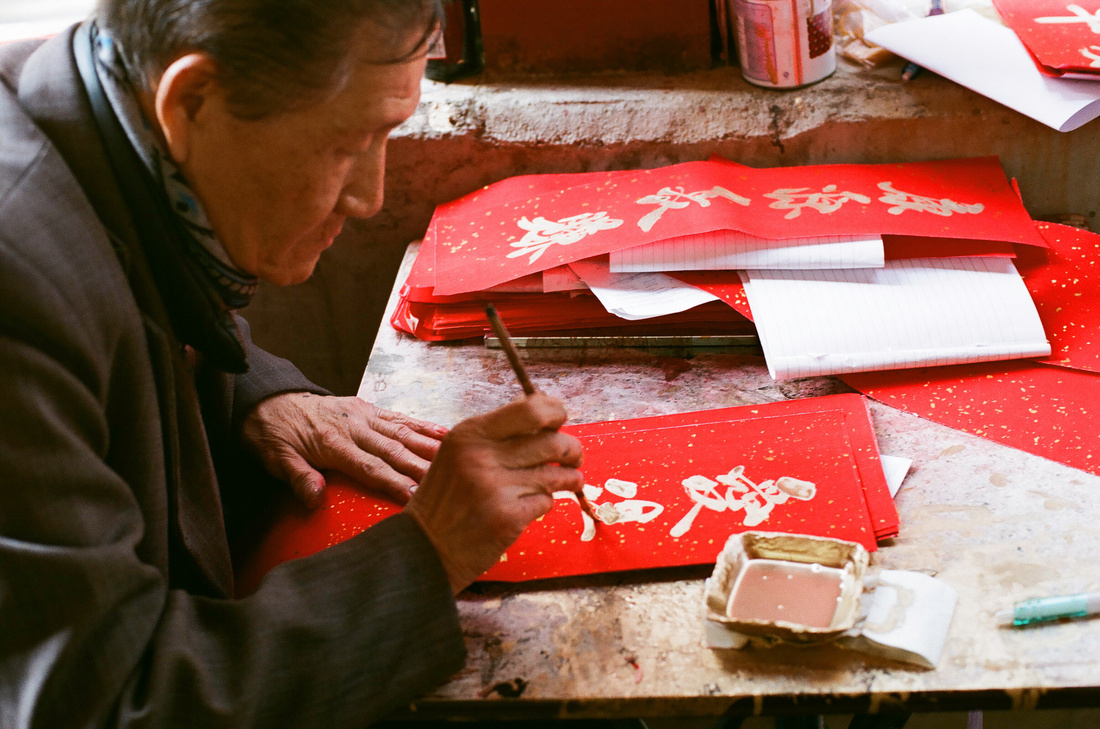
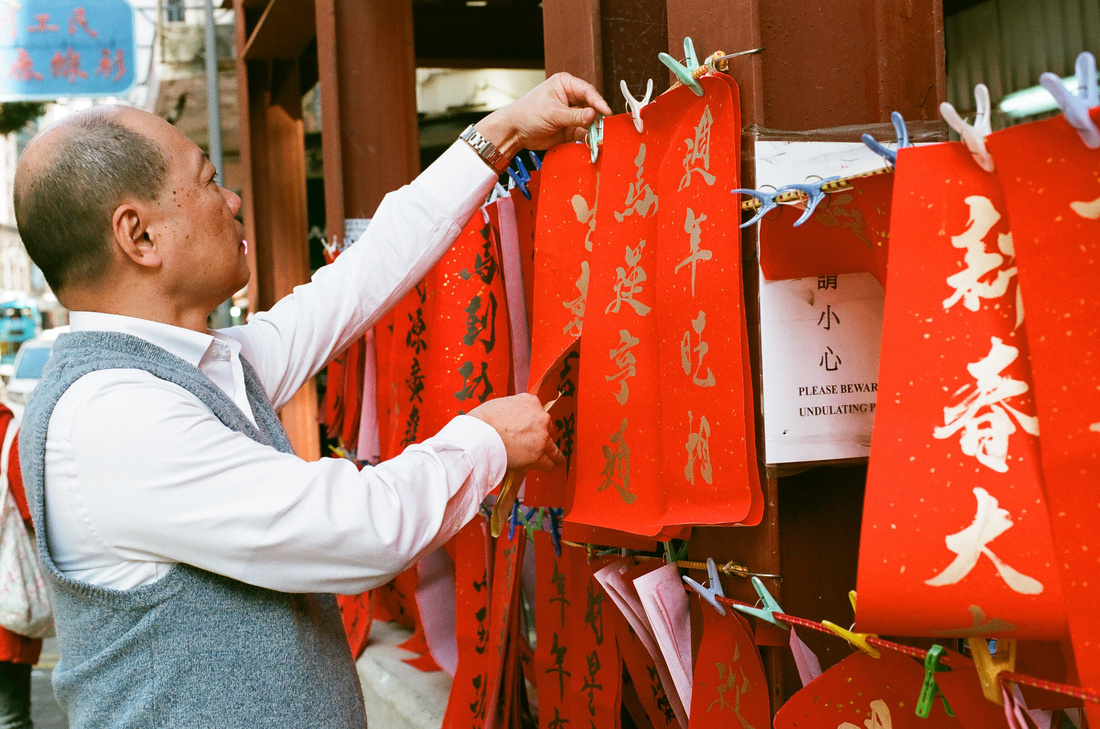
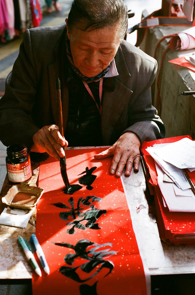
*Images here are original shot with Nikon F100 + Sunny 16 35mm Colour Film*
Casual Photophile Tip & Techniques No. 001 The Subject is the Subject
The Inspired Eye Photography Magazine Issue #40 (full interview)
Hong Kong Free Press: HKFP Lens
Blog #25 Don’t Be Afraid of the Dark[room].
Blog #47 Composition, Composition, and More Composition
Blog #65 Summer is for Travel (Hanoi)
Blog #67 Risks, Rules, & Restrictions
Blog #68 Photography is a Gift
Blog #72 Living the Creative Life
Blog #90 Restrictions, Revisited
Blog #93 Photographic Technique